Federal GOVERNMENT APPLICATION PROCESS
As part of a 300‑person federal modernization initiative, I collaborated with my team to analyze and redesign a complex section of a citizen‑facing application process. Our goal was to improve clarity, reduce friction, and ensure the experience met accessibility standards while aligning with strict policy and governance requirements. Because this work involved sensitive government systems, all details in this case study are fully anonymized
My Role
UX/UI Designer — Flow Analysis, User Journeys, UI Design, Usability Testing and Product Demos
I collaborated with my team to support UX work for a key section of the application, contributing to research, flow analysis and redesign, content structure, UI updates, prototyping, usability testing, and cross‑team communication. My work helped align UX, policy, content, and development teams within a large, 300‑person federal program.
Project Scope—
-
Evaluated how users—including participants with cognitive disabilities—interacted with complex steps in the application process.
Observed behavior, identified barriers, and translated findings into clear, actionable recommendations that informed flow, content, and UI improvements.
-
Analyzed and redesigned key portions of the application journey to reduce friction and improve clarity.
Simplified decision points, strengthened content structure, and ensured the experience aligned with policy, accessibility requirements, and the broader program’s governance.
-
Updated screens, components, and interaction patterns to improve clarity, consistency, and accessibility.
Designed within the federal design system and collaborated closely with developers to ensure accurate implementation across a complex, multi‑step workflow.
About the project—
The Challenge
The application process had grown over time through contributions from many teams, resulting in:
Confusing pathways and unclear decision points
Inconsistent content structure and terminology
High cognitive load for users with varying literacy levels
Accessibility barriers, especially for users with cognitive disabilities
Fragmented logic due to multi‑team contributions
Difficulty maintaining alignment across a large, 300‑person program
My teams’s role was to bring clarity, structure, and accessibility to a critical portion of the journey while ensuring the redesign respected policy, governance, and technical constraints.
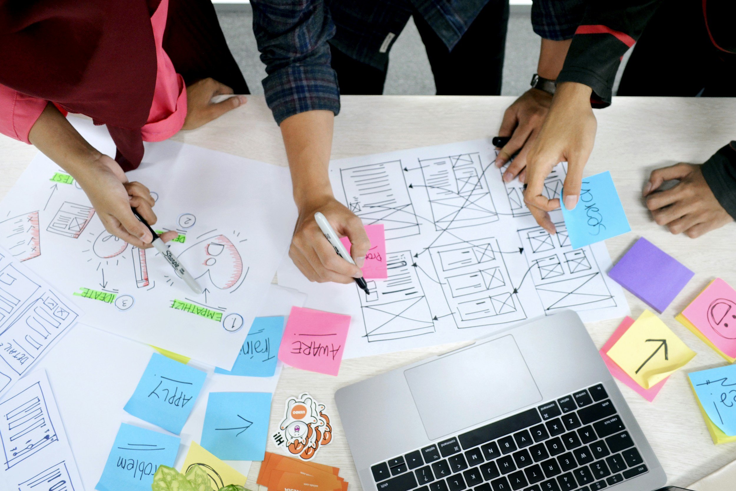
Flow Redesign & Mapping
With the issues identified, I redesigned a critical section of the application process.
Simplified complex decision points into accessible, user‑friendly interactions
Created journey maps, identified pain points using Adobe Analytics to align UX, policy, content, and development
Reduced unnecessary steps and clarified branching logic
Ensured redesigned flows adhered to program‑wide governance and constraints
These updated flows became the foundation for UI, content, and development alignment.

In‑Depth Usability Testing
To validate assumptions and uncover additional issues, I conducted extensive usability testing.
Facilitated 3 round of sessions with both standard users and participants with cognitive disabilities
Observed behavior, comprehension challenges, and accessibility barriers
Analyzed findings and translated them into actionable recommendations
Presented insights to UX, policy, and skateholder teams to inform redesign decisions
During our testing sessions, we were able to restructure the costs so that task completion rate was reduced from 55% to 97%.
UI Design
Once flows and content were aligned, I moved into UI design.
Designed updated screens and components aligned with the federal design system and accessibility requirements.
Improved visual hierarchy, spacing, and interaction patterns to support user comprehension across complex steps.
Created wireframes and prototypes to visualize updated flows, content structures, and UI patterns.
Iterated on designs based on feedback from policy teams and usability testing results.
Used prototypes to validate assumptions, clarify requirements, and reduce ambiguity before development.
Skateholder Communication
This program involved approximately 300 contributors across multiple departments.
Presented my team’s work to an audience of 300, including federal stakeholders
Communicated design rationale, flow improvements, UI updates, and usability findings
Strengthened alignment across a large, distributed program
Clear communication was essential to maintaining momentum and shared understand